![]()
Heat maps are useful for giving business users quick views of large amounts of data to find trends and anomalies at-a-glance. It would be very difficult to view and comprehend information about 2,000 items in a pie chart; a heat map, however, makes this possible. Heat maps can show relationships among hundreds or thousands of items in hierarchies with rectangular spaces divided into regions. Each region is divided again to correspond to each level in the hierarchy. Business users easily interact with these hierarchical, colorful regions to get more information.
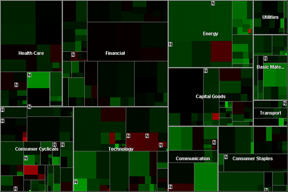
The Map of the Market heat map of daily stock quotes by SmartMoney.
Heat maps are especially useful when an organization has numerous facts to analyze, such as many sales regions, many manufacturing plants or hundreds of product lines and wants to monitor the complex activities among those many products, projects or salespeople.
Heat maps are comprised of multiple cells that have a varying size and color. Each cell has a specific label so that users can determine what each cell represents. The size, color and label for each cell are determined by values from three different points of data. In order to fully populate a heat map, select three distinct data columns for the label, cell size and cell color.
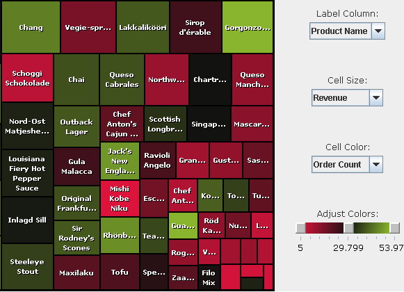
A heat map displaying the number of orders and revenue received from each product.
A cell is created for each distinct product name in the ProductName column. The size of the cell is determined by the corresponding value from the Revenue column; larger values produce larger cells. The color of the cell is determined by the value of the Order Count column.
|
Note: |
|
Numeric data columns must be selected for the Cell Size and Cell Color columns. |
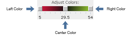
The heat map color slider displays gradients of 3 different colors.
The Heat Map component also includes an interactive color slider that allows dynamic modification to the gradients of three distinct colors that correspond with values from the cell color column. The left color corresponds to low values, the center color corresponds to middle values, and the right color corresponds to high values. The gradients help establish the relationship each cell color value has to another. In the example, the highest values will get the purest shade of green. Slide the control to the left to single out the lowest value. Slide the control to the right to find the cell with the highest value.