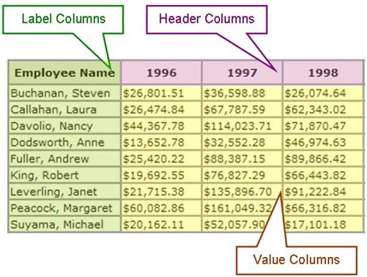
Cross tabulation style reports give users the ability to display joint distributions of data from three separate columns. The results of the cross tabulation are displayed in table format. Every crosstab table consists of three columns.
|
Column Type |
Use in Crosstab Table |
|
Header |
Populate the first row of the table. Each new value encountered in the crosstab column produces a new column in the crosstab table. |
|
Label |
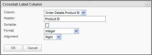
Populate the first column of the table. |
|
Values |
Populate the aggregate data. The aggregate values are a sum, count, standard deviation or average of the fields in the Value column. |
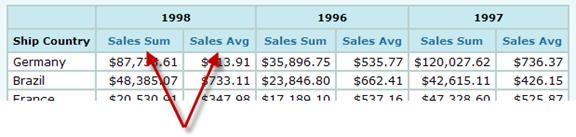
A crosstab report displaying sales totals per employee across years.
Users can also include crosstab summary data by adding an optional summary row or summary column.
In order to build a crosstab, you only need to pick three columns, Header, Label and Value, and decide how you want the value column be aggregated. These selections can be made in the Crosstab Configuration tab, with minimum attributes displayed.
You have many other options with the crosstab at your fingertips that you can use if needed. All of these other options can be accessed either on Crosstab Configuration page, with all attributes displayed, or on the Crosstab Settings tab.
Below, we will discuss how to create a crosstab with its minimum requirements and later introduce the optional controls.
To add a simple Crosstab table:
1. From the Report
Builder interface, click on the  in the Insert ribbon at the top
of the interface to add the Crosstab component to the report. Use drag-and-drop
methods to place the crosstab into the report in a specific location in the
Report Layout panel.
in the Insert ribbon at the top
of the interface to add the Crosstab component to the report. Use drag-and-drop
methods to place the crosstab into the report in a specific location in the
Report Layout panel.
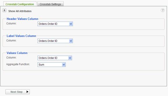
2. From the Crosstab Configuration panel's Header Values Column section, choose a header Column from the drop-down list.
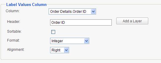
3. From the Label Values Column section, choose a label Column from the drop-down menu.
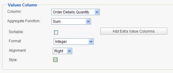
4. From the Values Column section:
a. Choose a value Column from the drop-down menu.
b. Choose an Aggregate Function1 from the drop-down menu.
Your crosstab table is ready at this point.
|
Note: |
|
1. The available aggregate functions are Sum, Average, Standard Deviation and Count. |
Exploring the options
Click on the Show All Attributes icon to view the extended options on the Crosstab Configuration tab.
If the Header column is a date column, a drop down list of time periods will be displayed.
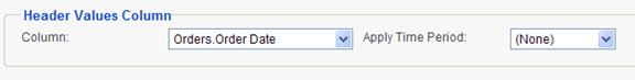
The options in the list include:
When all attributes are displayed on the Crosstab Configuration tab, the following extra options are available for Label column:
The following extra options are available for Value column:
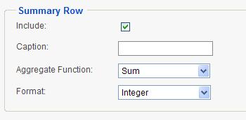
The following options are available for adding a Summary Row:
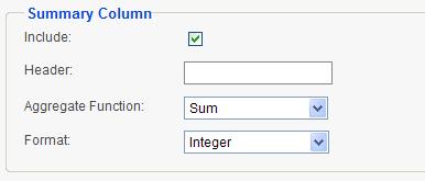
The following options are available for adding a Summary Column:
|
Notes: |
|
1. The default sort order of the Label and Header column values is dictated by the sort order of the Data Source, however a crosstab is created dynamically and may not reflect the expected sort order of the Label and Header. This is particularly true when the data has missing information. 2. The available aggregate functions for Summary Row are: Sum, Average (of crosstab rows), Standard Deviation, Count (of crosstab rows), Count Distinct, Average of All Rows, and Count of All Rows. 3. The available aggregate functions for Summary Column are: Sum, Average (of value columns), Standard Deviation, Count (of value columns), Average of All Rows (used for the particular row of the crosstab pertaining to the summary value), and Count of All Rows (used for the particular row of the crosstab pertaining to the summary value). |
|
Hint: |
|
Crosstab tables can become quite long if there are a large numbers of distinct values in the crosstab Label and Header columns. If such is the case, limit the data by setting parameters on the data from the Data component's Parameters step. |
Adding Drill-down Capability to Crosstabs
At times you may need to drill down to the details of a crosstab layer and find out how the top level values came to be.
You can add as many layers to a crosstab as you need in a very easy manner.
Click on the Add a Layer button to display the following dialog.
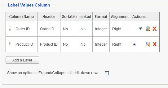
Each layer consists of another crosstab table identical to the main layer, but with a different Label column. It makes sense to pick a column that can serve as the detail for the Label column in the layer right above it.
All available columns, except for those that have already been selected for the previous layers, can be selected for this new layer.
Just like the main layer, a Header can be entered for this new Label Column and it can be set as sortable and/or linked (if pre-defined as being linkable). Its format and alignment can also be determined.
Once a new layer has been defined, the default view of the Label Values Column panel will change to a grid.
Layers can be moved up or down using  and
and or by using drag-and-drop
methods using the
or by using drag-and-drop
methods using the  handle. They may be edited using
  and
removed using
and
removed using  action icons.
Adding Multiple Value Columns
If more than one Value Column is needed under crosstab, additional columns can be added by clicking the Add Extra Value Columns button. The following Crosstab Value Column dialog will be displayed.
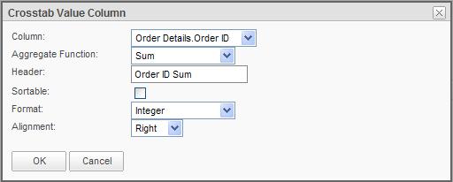
The process is exactly like adding the first Value Column. The difference is in the Header option, which is missing for the first Value column. However if multiple Value Columns have been defined, each column can have its own header, which will be displayed under the Header Column values.
Once a new Value Column has been defined, the default view of the Value Column panel will change to a grid.
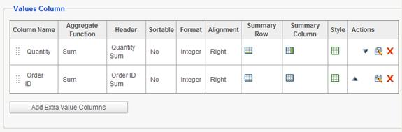
Value Columns can be moved up or down using or or by
using drag-and-drop methods using the handle. They may be edited using and
removed using action icons.
Separate Summary Row and Summary Column functions, as well as Styles can be defined for each Value Column by using respective icons in each row of the grid. If either of these items has been defined, their icons will change to an on state.
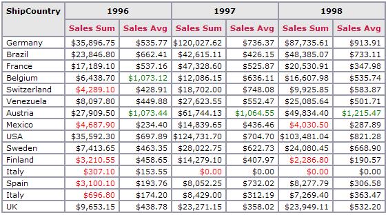
Conditional Styling of Crosstabs
Conditional styling of crosstabs is very similar to that of a data table. The only difference is that styles can only be set, as well as depend on Value columns. Therefore the columns listed in the Column dropdown only consist of all selections for Value columns.
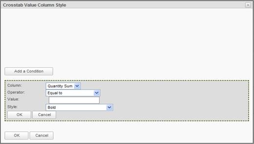
The following figure shows the results of conditional styling of Product Sales Sum to be red if the value is less than $5,000 and another green style set on Product Sales Average to show as green if sales average is greater than $1,000.
Linking from Crosstabs
If the administrator has set up links from any column that is used as the Label column for the crosstab, the Linked checkbox appears in the Label Column panel area. Since both links and drill-down are defined on the Label column, they cannot co-exist. Therefore only last layer of a crosstab can be linked. A link can be established to any other report or website. By checking Linked checkbox, the link is automatically enabled and the resulting report displays its Label columns as active HTML links that take you to the pre-determined report or web page, passing any required parameters to the report or site.
This feature can be used in lieu of drill-down, in order to display a report other than the detail crosstab report that is automatically generated by the application.
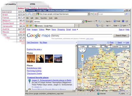
The following figure displays a linked crosstab that opens up Google Maps and shows the map of the selected country, each time a country link is clicked on the report.