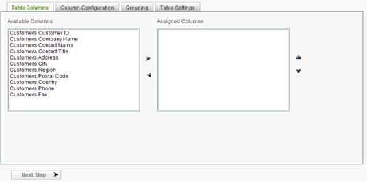
The first step of the table wizard is to select the columns to be used in the display table.
To select columns for the table:
 to add the column(s) to the
Assigned Columns list-box. Hold the CTRL key down to select multiple
columns.
to add the column(s) to the
Assigned Columns list-box. Hold the CTRL key down to select multiple
columns. or
or  icon
to move the row up or down. Hold the CTRL key down to select multiple
columns.
icon
to move the row up or down. Hold the CTRL key down to select multiple
columns. to
remove the column(s) from the Assigned Columns list-box. Hold the
CTRL key down to select multiple columns.
to
remove the column(s) from the Assigned Columns list-box. Hold the
CTRL key down to select multiple columns.|
Notes: |
|
1. At least one data column should be selected before continuing. 2. A column description will only be available if one has been specified by the System Administrator. |
To configure and delete columns in the table:
After having added columns, a column's order of appearance, display characteristics and summary information may be defined on the Column Configuration tab.
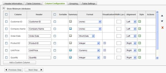
Initially only the Column, Header and Sortable columns are shown in the configuration grid. By clicking on the Show All Attributes icon, the grid is expanded as shown above. The grid may be collapsed by clicking on the Show Minimum Attributes icon.
Columns may be selected (or deselected) by clicking on the checkbox adjacent to the column. All columns may be selected or deselected by clicking on the checkbox in the upper left corner of the grid. Some of the following functions apply to the selected columns.
Columns may be rearranged by drag-and-drop methods using the
 handle
on the left of the grid. Mousedown on the drag handle, move the row to the
target location and release the mouse. Columns may also be rearranged by
selecting the row and then click either the or icon to move the row up
or down. To move a group of columns, select the desired columns by enabling
their respective checkboxes and then click either the or icon to move
the rows up or down.
handle
on the left of the grid. Mousedown on the drag handle, move the row to the
target location and release the mouse. Columns may also be rearranged by
selecting the row and then click either the or icon to move the row up
or down. To move a group of columns, select the desired columns by enabling
their respective checkboxes and then click either the or icon to move
the rows up or down.
Columns may be removed from the display table by selecting
the column(s) and clicking the  icon.
icon.
There are 9 configurable options available in Column Configuration:
The Header determines the column header displayed when the report is rendered.
The Linkable option toggles predefined hyperlinks for records in the column. Each record in the Linkable column contains a hyperlink to an address specified by the System Administrator. Make column records linkable from the report by placing a check in the corresponding Linkable checkbox.
|
Note |
|
The Linkable column will only be shown if the System Administrator has configured at least one of the columns as hyperlink capable . |
The Sortable option determines whether the column in the rendered report may be sorted by the end user. The Sortable checkbox determines the column s sort capability. Sort capability may be enabled or disabled for all columns by clicking on the checkbox in the header of the Sortable column.
The Summary option offers the ability to create table footers containing aggregates of values for each column of data. An unlimited number of aggregates can be created for each table column. The following aggregate functions are supported:
To manage summary values:
 to add a summary value for a
specific column.
to add a summary value for a
specific column.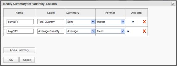
or icon to arrange the
order in which the aggregate will appear in the column. Aggregates may also
be rearranged by drag-and-drop methods using the handle on the left
of the grid. Mousedown on the drag handle, move the row to the target
location and release the mouse.icon|
Note |
|
The |
One of the aggregation options is Calculation . This option allows the user to create a new aggregation from previously defined summary information. When calculation is selected, the following dialog is displayed:
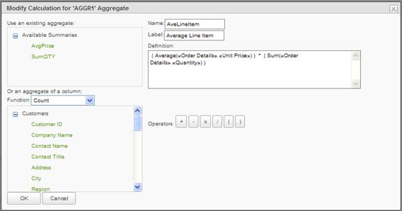
The AvgPrice and SumQTY aggregates have been used in the calculation of the AveLineItem in this example. These two summaries were simple aggregations on the Unit Price and Quantity column.
In the Modify Calculation dialog, any of the previously defined summaries may be used in the calculation as well as aggregate functions on columns and direct constants in the definition. The default internal name for an aggregation is AGGRn, where n is a unique number.
The Format option provides data formatting options for values in each column. The following formatting options are supported:
|
Notes: |
|
1. The application chooses the default Format type for each column. Changing the format type may yield undesirable results. 2. The Format of "HTML" may only be specified by the System Administrator and may not be changed to something different from the Column Configuration panel. 3. The Format of 'Preserve line feed' allows text in a memo type field to display as it is stored with line feeds (a.k.a., carriage returns) observed. 4. If a Format is needed that is not offered, contact your System Administrator. 5. Additional formats may be provided by the System Administrator |
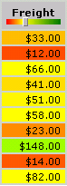
The Visualization option allows numeric fields to be displayed with a colored indicator. The following indicators are available:
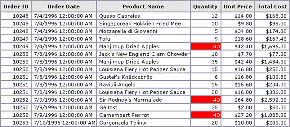
Color indicators allow the user to define their own threshold for comparing a value at a particular row with all other values in that column. When enabling visualization on a particular column, a color slider appears in the column header for setting the threshold. The color spectrum is determined by how much the data values in the column deviate from the specified threshold. Choose to visualize each cell value as a colored shape - bar, circle or square - or shade the entire cell background. Additionally, the numeric data value can be displayed adjacent to the visualization. Following is an example of visualization.
|
|
|
|
To add a visualization affect:
 to add a visualization
affect for a specific column. The Visualization Options dialog will
be displayed.
to add a visualization
affect for a specific column. The Visualization Options dialog will
be displayed.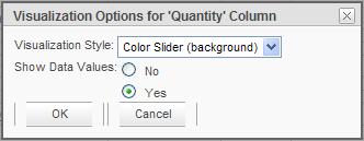
|
Note: |
|
The |
To modify or remove a visualization effect:
 icon associated to the column
with an existing visualization.
icon associated to the column
with an existing visualization.The Width option offer the ability to customize the width of each column, thereby improve the appearance of the report when it is rendered in the webpage and when exported (e.g., Word, PDF). By default, a column's Width value is left blank to allow the application the option to automatically determine the appropriate width based on:
When customizing a column's width, it is important to determine the scale by which an entered value will be measured. The scale of measured can be either pixels or percent where:
To modify a column's width:
|
Notes: |
|
1. When specifying a tabular report's column's widths in pixels, keep in mind the average monitor resolution settings of the end-users viewing the report. 2. When specifying a tabular report's column's widths in percentages, keep in mind that: a. The sum total of the percentage values must not exceed 100%. b. The application will use whatever percentage has not been allocated to columns for the columns without a value. |
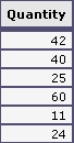
The Alignment option adjusts the position of values in columns. In the following figure, numerical values are now centered in the Quantity column.
|
|
|
|
The Style option offers the ability to apply conditional formatting to a column's cell based on a specific value or another column's value. Users must create the condition and specify the formatting style. When more than one condition is specified, the application will apply the style associated to the first condition that is satisfied. Conditions are evaluated when the report is run.
Users can optionally apply the specified conditional formatting to all data columns by checking the appropriate checkbox.
A conditional style takes the form of an equation similar to:
|
Notes: |
|
1. These operators are only available for data type of type String or Text. 2. The operators available are dependent upon the column's data type. |
To add a conditional Style:
 or
or  to access
the Condition Styles dialog. In the figure below two styles have been
added and the Add a Condition panel opened to show the various options in
the dialog.
to access
the Condition Styles dialog. In the figure below two styles have been
added and the Add a Condition panel opened to show the various options in
the dialog.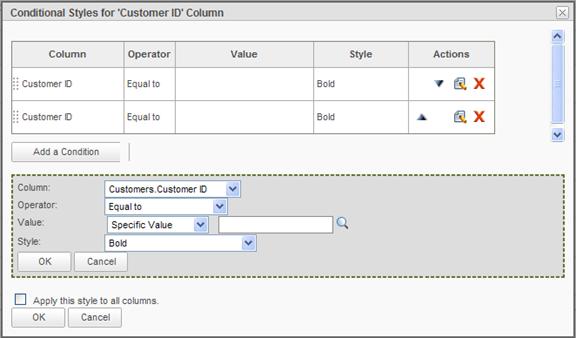
 icon to view and select a
valid value from the database. or icon respectively.
icon to view and select a
valid value from the database. or icon respectively.|
Notes: |
|
1. Pre-defined dates get evaluated at the time the report runs. 2. If the value is a number, the value field must contain a valid number to complete the comparison. 3. The |
To modify or remove a conditional Style:
icon to access the Style
Details panel for a specific column. icon associated
to a specific Style's condition. Modify the conditions as desired and
then click OK to save the
condition. icon associated to
a specific Style's condition.
icon associated
to a specific Style's condition. Modify the conditions as desired and
then click OK to save the
condition. icon associated to
a specific Style's condition.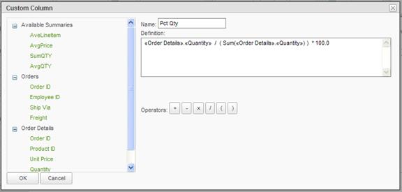
Note: If a data table contains a calculated column,
the configuration grid will display an Actions column. Clicking on the  icon
allows the column to be edited.
icon
allows the column to be edited.
 icon indicates that a summary
value exists for that particular column.
icon indicates that a summary
value exists for that particular column.