The Report Builder charting components allow various types of charts to be built to bolster a report. Charts provide a visual representation of data utilizing different styles and types. The following chart types are supported in the application:
In addition, animated versions of these chart styles are available. Since animated charts are not exportable, they are presented in a separate section of the interface.
To add a chart to a report, click on the Insert tab to display the reporting elements and click on the Chart option. The following chart select panel will be displayed:
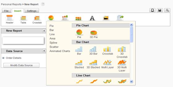
The chart panel offers categories of charts down the left side and a scrollable area on the right side with all of the basic charting options. Clicking on a category of chart will reposition the panel to display the selected options. Click on the desired chart type to add it to the report.
When a chart is added to a report definition, a tab called Chart Settings is created with the appropriate attributes for the chart type. If multiple charts are added there will be multiple Chart Settings tabs that follow the sequence of the charts in the Report Layout panel.
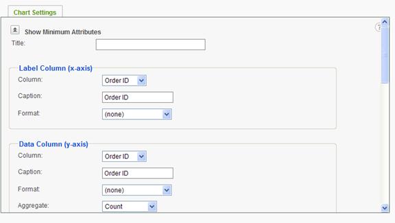
The Chart Settings tab will appear similar to the following (Bar Chart example):
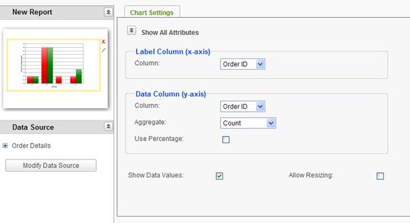
Notice that a bar chart image was added to the report layout area. The Chart Settings tab, by default, displays the most common and minimum attributes necessary to render a complete chart.
The  icon in the report layout panel
will delete the chart when clicked.
icon in the report layout panel
will delete the chart when clicked.
The  icon the report layout panel will
present the chart selection panel and allow a different chart type to be
selected. To the extent possible, the attributes of the current chart will be
replicated in the replacement chart.
icon the report layout panel will
present the chart selection panel and allow a different chart type to be
selected. To the extent possible, the attributes of the current chart will be
replicated in the replacement chart.
Click on the Show All Attributes icon to display the advanced settings available for the chart. Using the same example the Chart Settings tab will be redisplayed as:
Notice the scroll bar down the right side of the Chart Settings tab. Scroll down to view and set the advanced attributes for the chart.
Chart attributes are grouped according to functional area. Following are the general areas that may apply to charts:
|
Note: |
|
Not all charting attribute functional areas are available for all chart types. In addition, attributes in each functional area may be different based on the chart type selected and the data type of the selected columns. |
Three attributes are presented as stand-alone properties of the chart; Title, Show Data Values, and Allow Resizing.
The Title attribute value will be displayed as a chart title over the displayed chart.
The Show Data Values attribute will include the numeric data values driving the chart elements in the chart display. By default this attribute is enabled.
The Allow Resizing attribute will present resizing bars around the displayed chart so that the end user can adjust the display.
Attribute Functional Areas
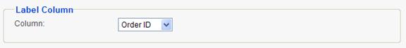
Label Column area The Label Column area allows the user to select the column to be used for a pie chart label. Data values will be aggregated based on this column.
Label Column (x-axis) area For X/Y charts, the Label Column area allows the user to select the column to be displayed along the x-axis, specify the caption for the x-axis and select the format.
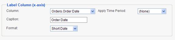
If the Label Column for the x-axis is a date column, a drop down list of time periods will be displayed (Apply Time Period). Data will be aggregated according to the time period.
The options in the list include:
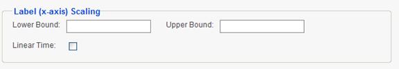
Label (x-axis) Scaling area the user may override the default scaling of the x-axis by entering values for the Lower and Upper Bound attributes.
If the column used for the x-axis content is numeric, the Linear Numeric attribute is available and if enabled will provide fixed numeric intervals along the x-axis.
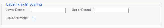
If the column used for the x-axis content is date oriented, the Linear Time attribute is available and if enabled will provide fixed time intervals along the x-axis.
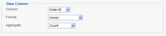
Data Column area The Data Column area allows the user to select the data to be shown in the chart, select the format from the suite of numeric formats, and select the aggregation function to be applied to the data.
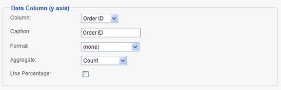
Data Column (y-axis) area For X/Y charts, the Data Column area allows the user to select the column used for the data displayed along the Y-axis. In addition the user can specify a caption for the Y-axis, select a format for the data values, select an aggregation function, and indicate whether the data values should be displayed as a percentage.
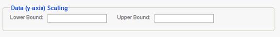
Data (y-axis) Scaling area - the user may override the default scaling of the y-axis by entering values for the Lower and Upper Bound attributes.
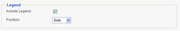
Legend area The Legend area allows the user to indicate whether a legend should be displayed for the chart. For some chart types the user may also select the legend position relative to the chart.
Relevance area a Relevance filter allows the user to specify data thresholds to be included in the chart.
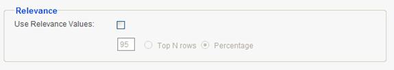
Enable/Disable a relevance filter by clicking on the Use Relevance Values checkbox. Identify the relevance scale by clicking on either the Top N rows or Percentage options. Enter the threshold value in the area provided.
For example, only the top 75% of data in the chart could be relevant. In this case, check the Use Relevance Values checkbox, enter a value of 75 in the value field, and click the Percentage radio button.
Alternatively, only the top 5 rows of data in the chart could be relevant. In this case, enable the Use Relevance Values feature, enter a value of 5 in the value.
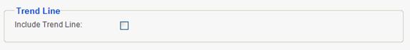
Trend Line area the Trend Line area allows the user to indicate that a trend line should be displayed on the chart.
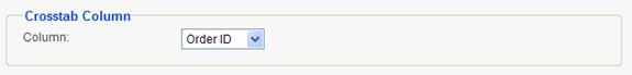
Crosstab Column area the Crosstab Column area allows the user to identify a second column of data to be represented in the chart.
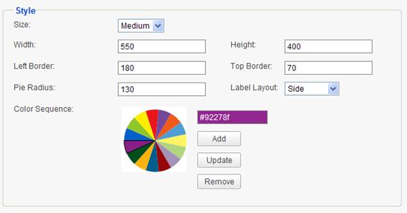
Style area the Style attributes allow the report designer the change the size and spacing regarding the display element. Two examples of Style areas follow:
Pie Chart Style
X/Y Chart Style
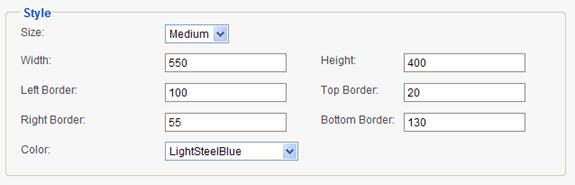
The Size attribute drop-down list offers three standard sizes; small, medium and large. Selecting one of the standard sizes will reset the other size attributes. If the size attributes are over-ridden, the Size attribute will be set to Custom.
Color may be set by exercising the color wheel or selecting colors from the drop-down list, depending on the chart type.
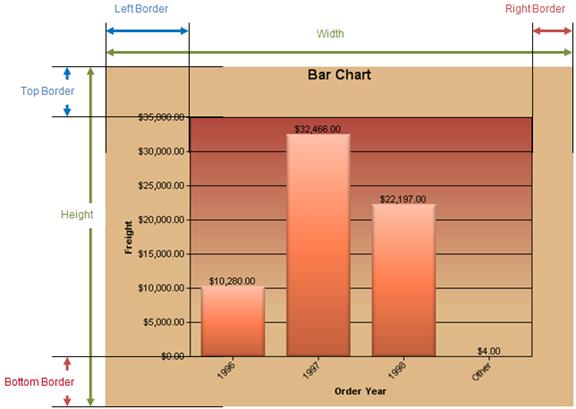
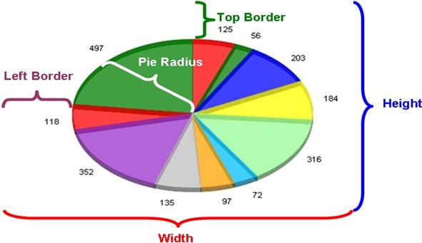
Definition of different areas of a chart have been described in the figure below.